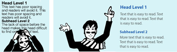
Headings - White space before heads emphasizes the heads and makes them easier to see. Leave a little more space above heads than below them to visually link the head with the text that follows.
If there is room, try setting subheads in a narrow column to the left of the text. This is one method to help the reader quickly and easily identify the organization of the material and find the information they are looking for.
Columns – Leave enough space between columns to clearly identify separate columns. This space, called a gutter, keeps the reader focused on one column at a time as the eye moves back and forth from line to line of text.
White space helps relieve stress
A page full of text with a line length that is too long and with minimal left and right margins creates stress. A reader's initial reaction is likely to be “This is too much info. I can’t read it all.” That’s not the reaction you want.
I once worked on a project to develop a workbook for gambling addicts. We tested the first design on a group of our intended readers. The readers bluntly said they would NOT read the workbook because there was too much information. Increasing space between text lines, paragraphs, and at the bottom of pages made the information more accessible to our audience.
Some suggestions:
Line length – Line length is measured in characters. (Count each letter, number and white space per line to get the line length, then take an average of several lines.) The most readable line length is 55 to 72 characters long.
Page density – Decrease the density of information on a page by adding space to the top and bottom of the page. This will slow down the presentation of information, increasing the likelihood that readers will absorb the details. A page with 6 paragraphs is less daunting to read than a page with 12 paragraphs.
Researchers have found that the use of white space between paragraphs and in the left and right margins increases comprehension by almost 20%. (Lin, 2004)*.
White space communicates quality
Go ahead and click on one of those advertising pop-ups that promises to make you 10 years younger if you use their product. See any white space? Not a chance. If your message is not offering a quick fix and you want to communicate something that is meaningful and worthy, then use white space. Present your message with confidence and pride. Let it stand clearly in the open space.
The final message is this: If you want to communicate your message then the priority is to clarify the information, organize it, and present it so readers can find what they want and understand what they find. White space can help this process. It’s your friend. Use it wisely.
* Lin, D. Y. M. (2004). "Evaluating older adults' retention in hypertext perusal: impacts of presentation media as a function of text topology." Computers in Human Behavior, 20.
