the blog
This blog was developed in collaboration with a team of experts in plain language and design. Thank you to all contributors!

Legal and legislative procedures and regulations can be complicated and difficult to understand. We often avoid even attempting to read this information because of the initial stressful impact of lengthy text and legal wording. This was the barrier Merit Nova Scotia faced when they decided to lobby the Nova Scotian government to make changes to the Nova Scotia Trade Union Act.
Merit believed that the Act was unfair in its process of determining whether or not an open construction shop is union (closed) certified. The current certification process reviews only a single day of work and if the number of union employees is over 49% on that day then the shop can be union certified…by law, no vote. Merit felt this was an unfair practice forcing open shops to become unwilling recipients of union certification and therefore unable to hire non-unionized workers.
Merit decided to begin their advocacy to lobby the government through a website where they would explain the difference between open and closed shops, how the law worked, and how they believed the law should change. This could have been a complicated (and dull) topic but Merit’s goal was to get their message across in a clear and persuasive manner so that their audience would read the information, understand it, and then take action. To aid in the goal of clarity, Merit wanted to include a narrative story as an example to show how the current legislation can lead open shop contractors, unknowingly and unfairly, into becoming a union certified (closed) shop.
I was approached by Merit to be part of a project team; alongside a web designer and clear language writer, my role was the design and illustration of the visual narrative. The story was a fictional, but based on fact, experience of an open shop and how they became union certified.
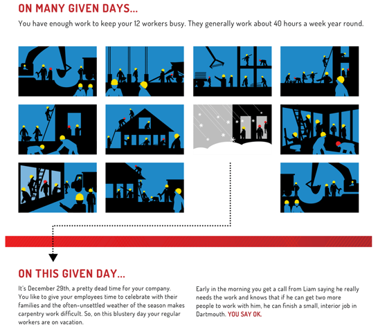
The theme of the website was “any given day”. Taking the look and feel of the website I developed a separate pdf that could be downloaded and scrolled through like an infographic. The graphic image style I choose followed the criteria for simplicity. I took the initial clear language narrative and broke it down into sections, created illustrations for text that could be explained better in an image, and generally cut it back to the functional parts of the story.
Below you see a portion of the narrative that visualizes the shop’s work practice for 11 days. It clearly identifies the single day in the story with an arrow pointing from that image to the continued story text. It also clearly identifies the difference between the union and non-union employees by the coloured construction hats (red for union, yellow for non-union). The main point to be made was that the ratio of union to non-union workers can vary from day to day and on “any given day” there could be a majority of union workers but over a period of 11 days it might not be the norm. The question then is “is this fair?”
This story offered the reader an alternate voice to the website pages and the current legislation; a voice that gave the reader a clear and less stressful place to understand the issue.
For the full pdf go here:
